Shades of Spring
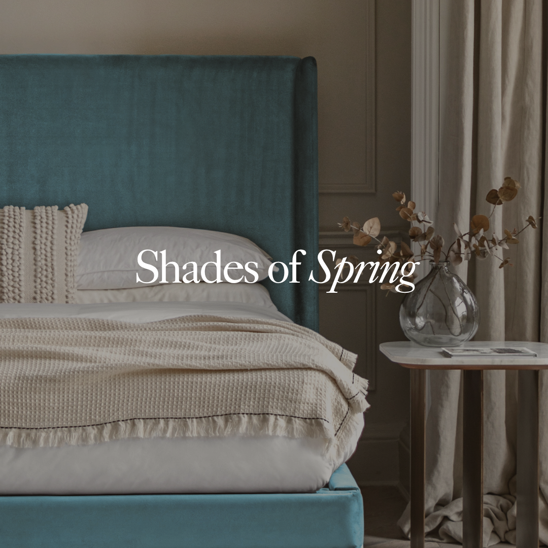
This season, there’s a new colour code of conduct on the scene.
This year, the usual rules of colour conduct need not apply. As with other streams of style and disciplines of design, what we once knew and loved is renewing. Our usual tenderised favourites of pastel blue, pink, green, and yellow are receiving a regeneration and resurrecting as new and improved – and somewhat unexpected but perfectly placed – shades of spring. These are the new rites and rules for orchestrating a seasonal home interior.
Across that landscape, we’re seeing a revival of retro trends, alloyed with uber modern approaches. Contemporaneous with mid-century styling, swarthy shades transport us away from the usual cool minimalism and twee tones for a rich, more embodied sense of home. Grounded but hopeful and playful with unprecedented pairings rather than the folly and frisson of feverish sweet favourites, these are the new rites of the spring home interior.
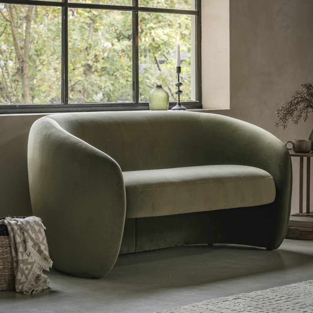
Dewy drops of green
Soft, earthy greens are one of the biggest colour trends this year (beyond spring) offering style longevity. Shepherded into the mainstream by the biophilic movement, our hankering for greens is elevated to new arboreal heights this season.
Savoury favourites sage and olive are accompanied by the dewiness of moss and cooling qualities of eucalyptus. Together, our green gauges are grounded in positivity and rooted in restoration and soothing. Within the home interior, they strongly connecting our internal landscapes to external ones.
Widely used on walls and commonly concealing kitchen cabinetry, these verdant tones also perfectly lend themselves to upholstered furniture. Paired with warm woods, they invoke the nostalgic neo modernism of mid-century movement and supporting stone accents firmly root these vestigial tones in modernity.
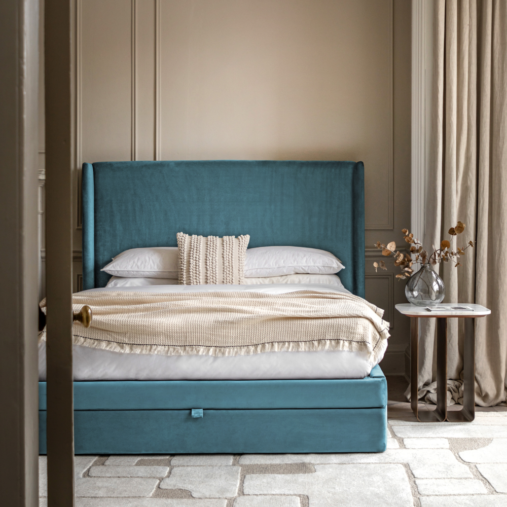
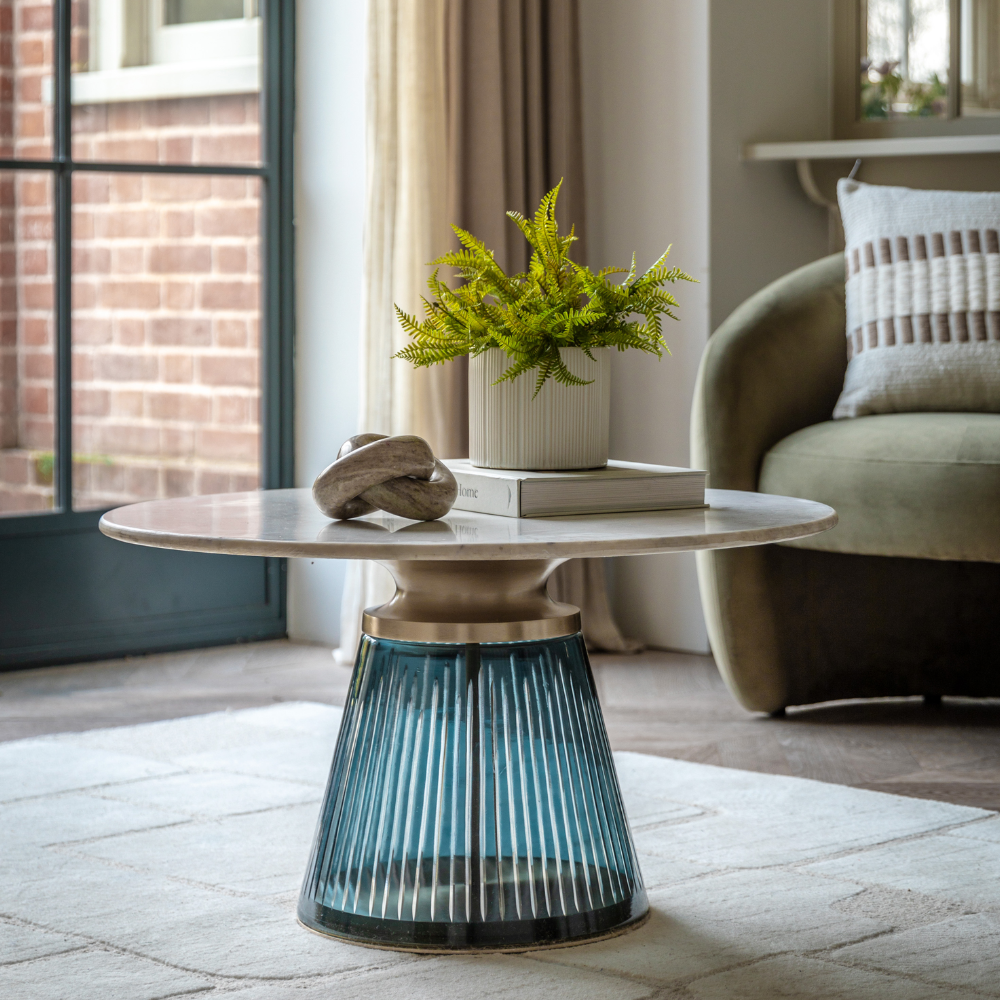
Bolt from the blue
Seemingly out of the blue, tender and tepid tones are not on the spring 2026 mandate. The evolution of blue is progressing, and glacial autumnal and wintry tones are rapidly invigorated into vivacious incarnations. The usual segue from navy and midnight blue to floury pastels is rescinded in favour of fresher, softer, more atmospheric hues. Trending variations include teal, misty or desaturated sky blues, and smoky permutations of pastel blues.
The beauty of blue is its easy versatility. Universally symbolic of serenity and reassurance, the efflorescent terrain of spring’s shades is balanced but slightly futuristic, lending perfectly to feature walls, bathrooms, and statement upholstery pieces.
Mineral soaked pastels
Traditionalists rejoice as we see a nod to pastels in the guise of mineral hues. A huge style cornerstone for many seasons gone by, the seemingly finite nature of organic shades continuously evolves to surprise and delight us.
This spring, mineral-esque pastels don a dusty jacket, coated in mineral splendour rather than sugary sweet whimsy and candy cane conviviality. Powder pink, muted lavender, dusty peach, and powder blue grow up with sandy and grainy undertones to reduce their stimulation and maintain a staider solution to spring pastels.
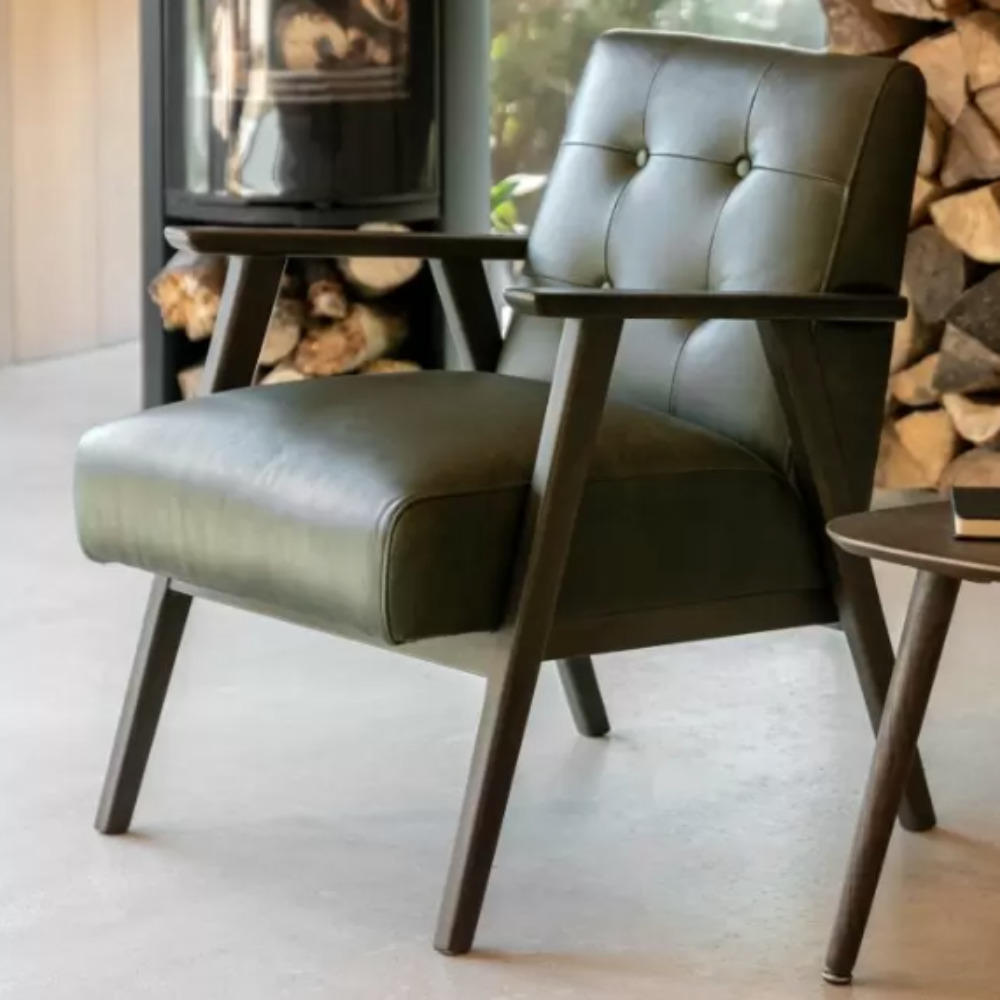
Down to earth
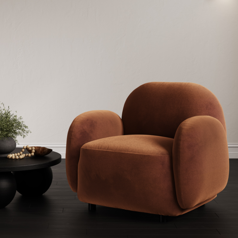
Beneath our feet lies a bounty of design inspiration and creative catalysts. Earthy reds, terracotta, and rust coat our earthly planes, and pouting posies of yellow and ochre burst through its seams. And this is proving a pivotal point of inspiration for home interiors. Particularly with 1970s nostalgia dancing across the landscape.
With this retro revival, earthy tones trawl back into the spotlight. Key colours include burnt orange, terracotta, burgundy, and clay red. Usually reserved to invoke the transformation of nature in autumn, or warm the frigid winter months, spring implores us to add dashes of earth to upholstery and soft furnishings or simply cosset simplistic wood finishes for a longitudinal homage to the trend.
Build these tones on an infrastructure of stable neutrals, like sand, taupe, chocolate brown and creamy off-white to allow them to fully verbalise their style language throughout the home.